
While keeping up with Web Design trends keeps your site looking fresh and modern, popular design techniques must be strategically executed to ensure they are enhancing user experience and helping your online business grow.
Some of the hottest website design trends can cause more harm than good if not implemented with purpose and thoughtful intent. We’ve all seen sites that go overboard with fancy motion graphics, infinite scrolling and unorthodox layouts that create clutter and chaos. Before getting trend-happy, step back and decide what is appropriate for your business and your customers.
How to Properly Implement the Top Web Design Trends for 2014
1. Flat Design
The web design community has been greatly influenced by the latest Windows, Android and iOS interfaces, which all utilize a “flat” design aesthetic. Flat design is devoid of things like drop shadows and gradients, and takes on a minimalist approach to fonts, icons and other graphical elements.
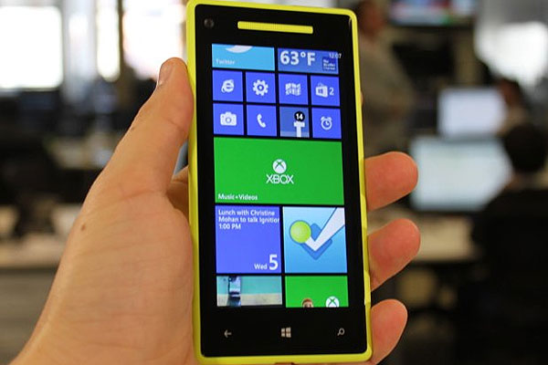
Windows Phone flat design
The biggest challenge with flat design is that minimalism can be quite difficult to perfect. Bold fonts and simple icons on a white background, for example, must consist of carefully chosen typefaces, crisp visual hierarchy and perfect spacing in between elements. When not executed properly, a flat design will not translate into a good user experience.
2. Responsive Website Design
Responsive design is a fairly new trend that requires a sharp learning curve for designers and developers. Since responsive websites are all-in-one solutions geared to provide optimized user experiences for all device types, elements like content, navigation and usability should be given extra care.
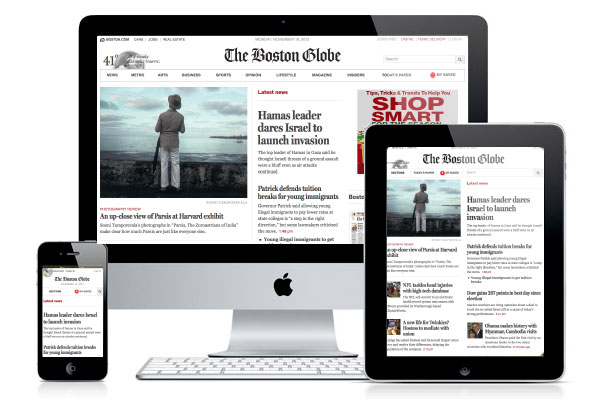
Boston Globe responsive website
Content
When planning a responsive site, it’s critical to first map out the content appropriate for each screen size, starting with mobile followed by tablet and desktop. For smaller device types, content hierarchy must be cleverly thought out, as you’ll have less room for important site messaging, calls to action and content you want users to engage with.
Navigation
Navigation menus typical of desktop sites do not work for mobile. Therefore, a mobile-friendly nav menu should be designed to accommodate small screens. The more categories and pages your site has, the more robust your menu will need to be.
Usability
Only within the past several years have digital professionals begun to analyze user behavior on mobile devices. As mobile web usage increases, designers and UX experts continue to find compelling ways to present content.
Before you embark on a responsive design project, it’s important to consider what you want to accomplish with mobile versions of your site. For example, tablets are very popular for online shopping and browsing content-rich sites. Mobile phones on the other hand are great for displaying visual content like photos and videos, but not for tedious tasks like filling out forms or completing multi-step functions. You must serve content that matches both user intent and capabilities of each device.
3. Deep Scroll
A deep scroll site throws out the now outdated “above the fold” rule, and allows content to be presented via a vertically scrolling interface. The trend was a response to the popular scrolling action performed on mobile phones and tablets, and has shown to provide great value to users.
Two of the biggest mistakes made on deep scroll sites are providing too much content and not creating a “story” or series of hooks that guide people down the page. While it’s tempting to design a page that scrolls for 10 minutes (just because you can), you run the risk of creating such clutter and disarray that usability becomes obsolete.
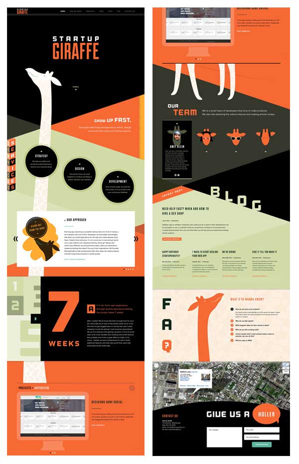
Startup Giraffe deep scroll website
The most effective way to design a deep scroll page is to create a series of sections that work together to create a narrative about your products or services. The page as a whole should be considered a brochure for your business, starting with an intro and ending with a payoff or call to action. For simple brochure-type websites, the entire site may consist of a single page. For more robust sites, the Homepage can be deep scroll while inner pages can be standard templates.
Startup Giraffe, featured in the above image, includes the following sections on their website: Introduction, Services, Projects, Team, Blog, FAQ and Contact. This setup presents a nice overview of their company in a visually compelling manner, without forcing users to bounce back and forth between inner pages.
4. Parallax
The parallax effect is one of the most trendy – and overused – web trends. Parallax refers to the overlapping of images and text that move over top of one another as a user scrolls. This creates the illusion of motion.
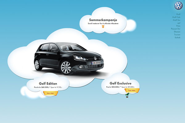
Volkswagen deep scroll site (visit site)
There are several challenges with the parallax scroll effect. First, images need to be optimized for the web, or they may cause issues with page loading. Second, the design of overlapping elements must be executed with precision or the end result can be visually jarring. The rate at which elements move, referred to as the parallax coefficient, should be adjusted to provide smooth motion that is easy on the eyes and allows any included text to be easily read.
5. Motion Graphics
Advances in front-end coding such as HTML5 and jQuery offer motion graphic capabilities that eliminate the need to rely on Flash, which is not compatible with Apple products. Motion graphics are effective when used appropriately; however, far too many designers are going overboard with effects that create confusion and detract from usability.
We’ve all seen over the top, seizure-inducing motion graphics that serve no tangible value for users. Every element on a website should help guide a user closer to conversion and design for design’s sake should be avoided at all costs. Rotating banners with 27 slides and text effects that take 5 minutes to load are examples of things to stay away from.
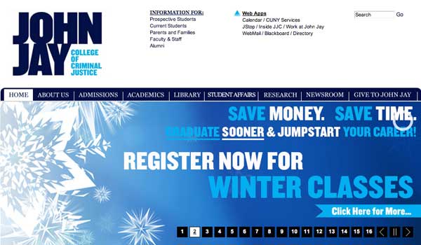
Rotating homepage banner with 16 slides
Current trends are shifting towards simplicity, as mobile optimization and user experience take center stage in the web industry. Use visual effects sparingly and always consider how they play a larger role in enhancing UX and driving conversions.
©2024 FUZE DIGITAL INC. Ignite Your Brand™ | privacy


