
Here are the hottest website design trends for 2015.
As we covered in our article, “Best Practices For Top Web Design Trends For 2014”, last year gave rise to some game-changing advances in the web industry, and we expect 2015 to follow suit.
Here are our top 10 Website Design Trends for 2015
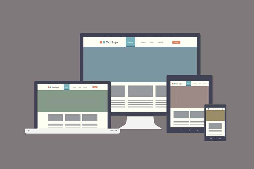
1. Responsive Design
As the the popularity of mobile continues to grow, more clients are realizing the importance of creating cross-platform experiences that allow users to browse, shop and interact with content regardless of their location or device type.
Responsive website design allows content on a website to change format dynamically according to screen size. Responsive sites use a single backend and rely on CSS media queries and fluid grids to serve layouts that fit specified screen resolutions.
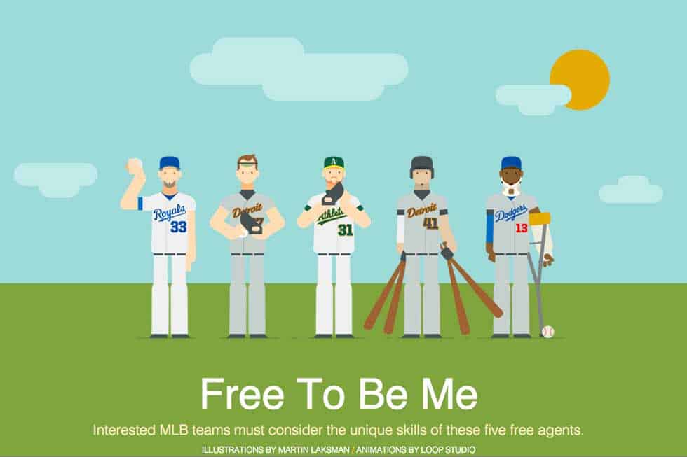
2. The Return of Motion Graphics & Animation
The death of Flash created a major lull in the use of motion graphics and animation for web; however, HTML5 has brought it back to life, and applications like Adobe’s Edge Animate have given the web industry some pretty amazing non-Flash alternatives for producing interactive content compatible with all major browsers and operating systems.
Brands like ESPN, for example, are using animation to bring their content to life in ways that we have not seen in some time. While few yearn for the days of slow-loading, 10 minute long Flash videos, it’s great to have more options for delivering memorable content that users are excited to interact with, and share.
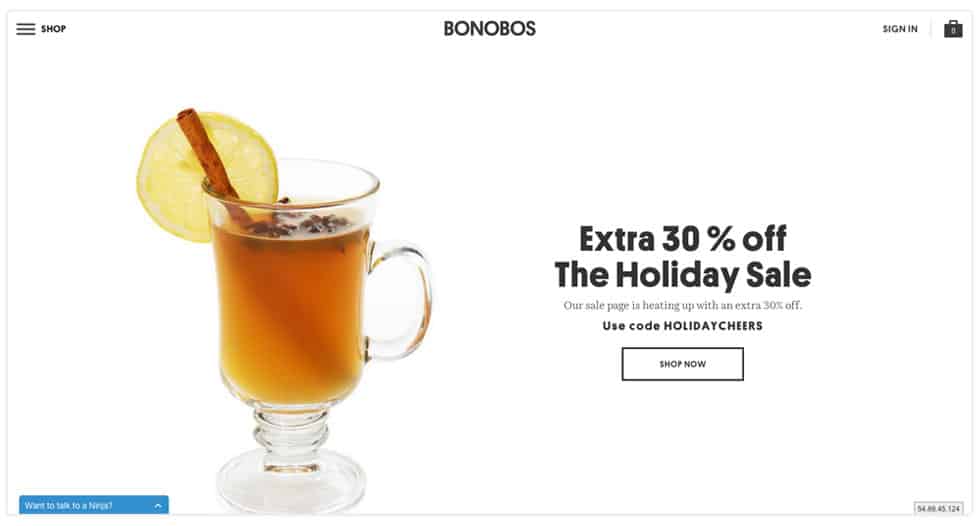
3. Mobile-centric functionality on Desktop Sites
Some brands don’t stop at a responsive website when making the leap to mobile user experience. Bonobos, for example recently launched a redesign featuring a mobile hamburger that activates a slide-out drawer menu that houses the site’s navigation.
Sound familiar? In case you haven’t noticed, check out our very own hamburger at the top left of your screen.
Implementing mobile navigation on desktop sites has spawned some heated debate among user experience experts; however, we love the approach and are fans of finding ways to shake up old practices.
4. Immersive User Experiences
It’s been both exciting and inspiring to see so many designers and brands break down the walls created by the dated “above the fold” rule, and deliver cinematic full-screen experiences that provide new levels of interactivity.
We’re beginning to see lots of full-screen video and a continued use of long scroll and parallax effects, which provide ample opportunity for bold visuals that stimulate the senses and bring brands to life.
5. Video
Video has become a vital component of web design, due to its power to deliver a diverse range of content in a format that consumers love. Next to Google, YouTube drives the second most search queries and, moreover, video has taken over as the most consumed content on the web.
Users interact with video more than any other type of content, which means it has boundless ability to supplement or even drive SEO, Digital Advertising, Social Media or Content Marketing efforts.
Examples of websites making excellent use of video:
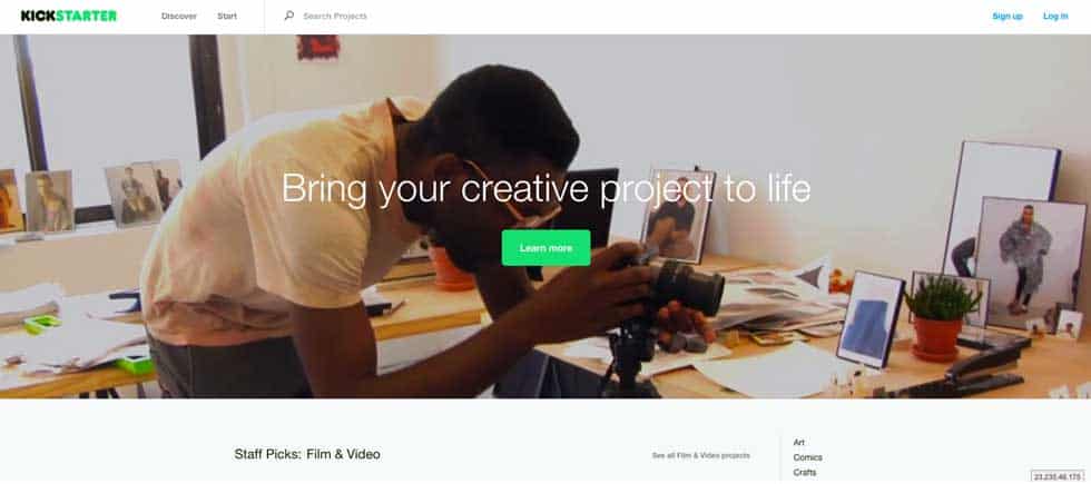
– Kickstarter: http://www.kickstarter.com/
– Drexel University: http://www.getgoingtoday.org/u-wild-enjoy-struggle
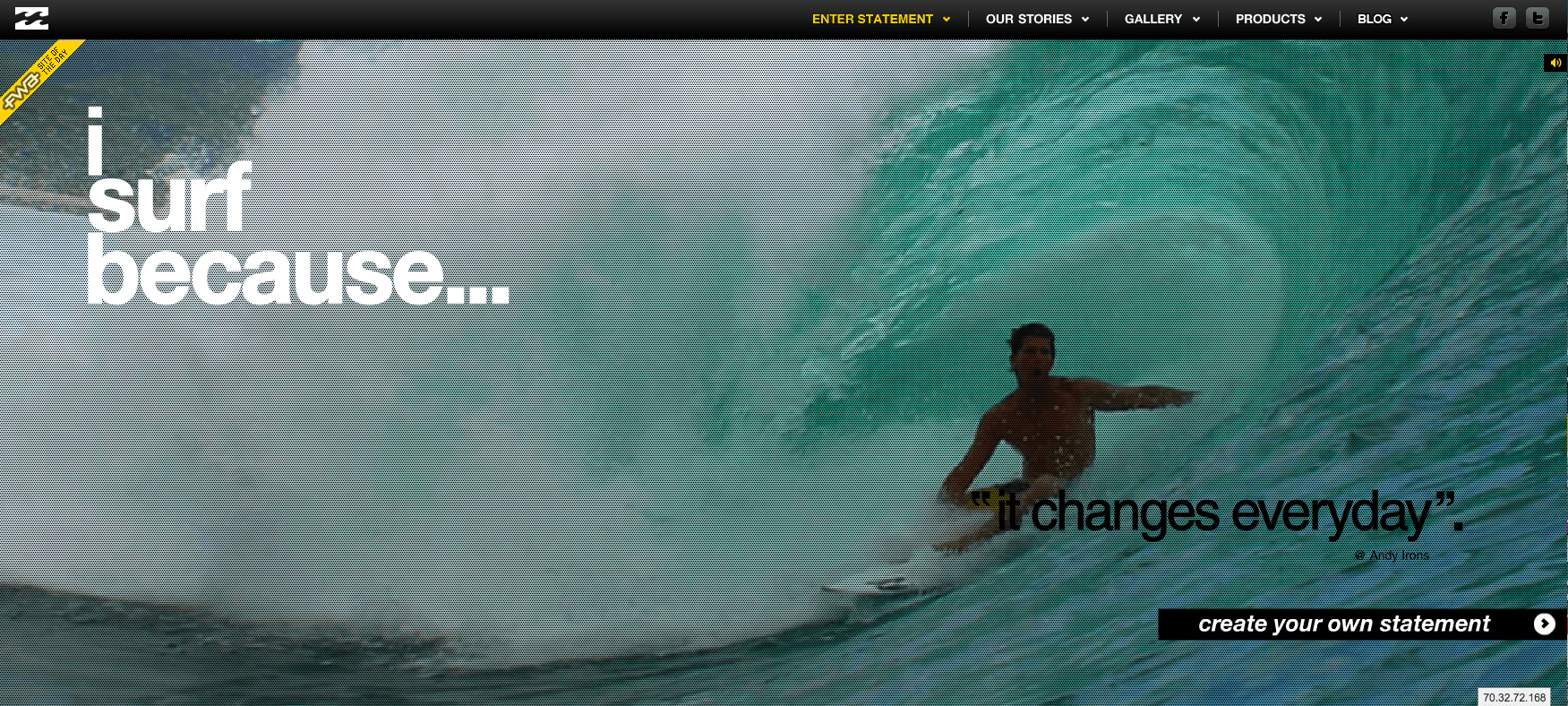
– Billabong: http://www.isurfbecause.com/
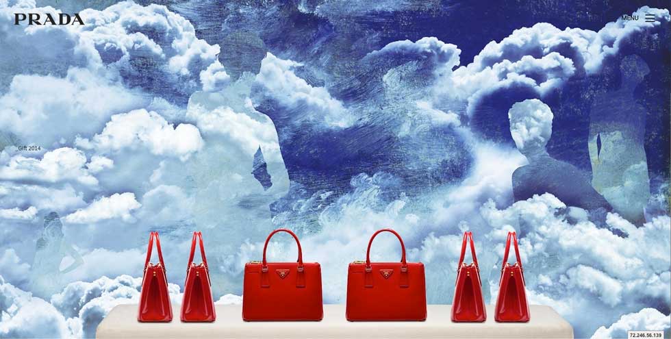
– Prada: http://www.prada.com/en/a-future-archive/short-movies.html
A recent study by Shutterstock and Comscore, produced some of these staggering statistics:
– 60% of the data on the internet is video
– 190 million Americans (61 percent of the total population) watched an average of 397 online videos in the month of January 2014.
– 1 in 6 videos are viewed on mobile devices.
– Advertising dollars spent on video more than doubled from 2012-2013.
6. More Long Scroll
Let’s finally admit it, we love to scroll! From childhood we are taught to appreciate exploration and crave the wonder that comes with anticipating something amazing being just around the corner.
Long scroll websites allow content to take on an immersive aesthetic that encourages discovery and provides far more enjoyment than seeing 10 paragraphs of text crammed above the fold.
Also, marketing experts have concluded that if users are scrolling below the fold, it probably means they are interested and are consuming your content.
Is it better to be so limited above the fold that you lose a visitor within 10 seconds due to lack of information? Or would you rather provide as much content as you need to sell your product or service, and allow users to read as much, or as little, as their heart desires? Let them scroll!
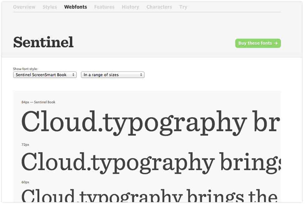
7. Cloud Typography
One of the most useful trends in web design is the ability to incorporate fully scalable web fonts, served via the cloud, that appear crisp at any resolution.
Our favorite resource for cloud typography is Hoefler & Co.’s typography.com, which provides a variety of beautiful web fonts like Gotham, Sentinel and Whitney , all available for integration with websites using simple CSS scripts that pull the fonts into the code from Hoefler’s cloud servers.
This technology means that designers are no longer restricted to using default system fonts, or using images for non-system variants.
©2024 FUZE DIGITAL INC. Ignite Your Brand™ | privacy


