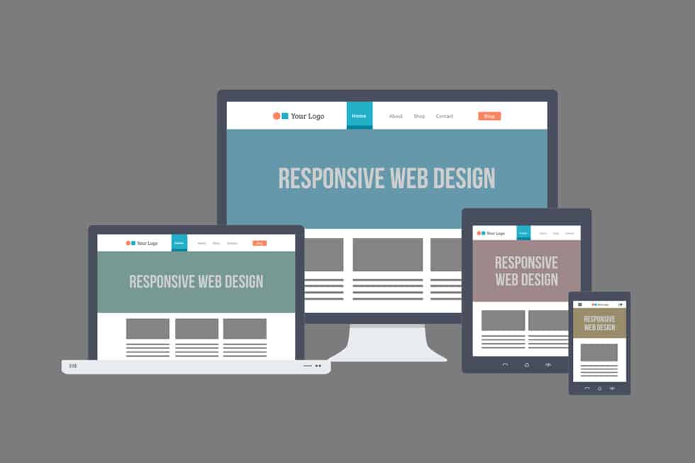
Several years ago, the only way to ensure your website was compatible with the latest devices, was to create multiple independent versions. This costly and time consuming process involved designing and developing separate instances of your site for each device type.
However, with new device types and screen sizes popping up every day, it became impossible to keep up with the madness.
Thankfully, the digital gods have blessed us with Responsive Website Design: an all-inclusive solution for providing your visitors with a coherent, device-agnostic experience.
What is Responsive Website Design?
Responsive Design enables you to build a single website that responds or adapts to the most commonly used device types. Some recent examples of major companies and brands making the shift to Responsive are The Boston Globe, Grey Goose, Target Corporate and Barack Obama.

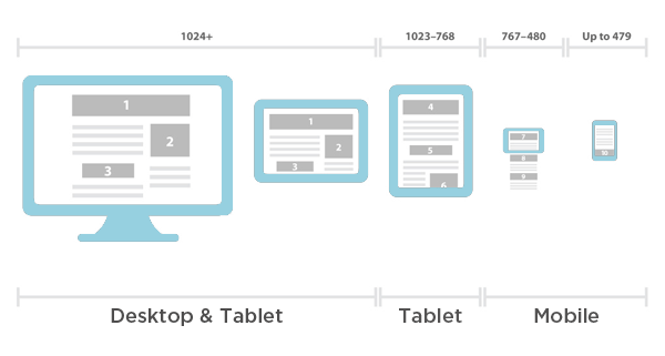
A responsive website uses “media queries” to detect the resolution of the device it’s being served on, and adapts to fit the screen. The front-end of the site utilizes a fluid grid with flexible images sizes, to allow for the layout to shrink or expand accordingly. For example, a three-column desktop layout will fluidly adjust to a two-column layout for tablet and one-column for mobile.
Why Should You Consider Responsive?
1. Cost
Building a Responsive Website can cost 30-40% more than a stand-alone desktop site; however, when considering the cost for building and maintaining separate desktop, tablet and mobile sites, Responsive Design wins the return-on-investment battle.
2. Time
As responsive sites are built on a single back-end, they are much faster to develop than a scenario where separate iphone and tablet applications are built apart from the desktop site. Additionally, future site updates are simplified, as you no longer have separate CMS’s to manage and maintain.
3. Cohesive Cross-Platform Experience
Responsive websites are device-agnostic, meaning they do not rely on being optimized for specific operating systems. Instead, they focus on accommodating a variety of screen sizes. This means when a new version of the iPhone or Samsung Galary hits the market, your site will already be set up to serve the appropriate layout, without needing major adjustments to the code. This is a luxury that will save on time and money, as well as please users who upgrade to new devices.
4. User Experience
The rise of mobile has raised the bar on what users expect from sites viewed on smartphones and tablets. People expect their online experience to be seamless regardless of device type, and to be consistent across all environments. Responsive sites ensure that images, text, buttons and other graphical elements resize to accommodate a user’s screen size. This flexibility creates consistency and digital cohesiveness, both of which enhance brand perception and user engagement.
5. Google loves responsive (but only if your users do)
Google knows that websites are for people, and it has been continually tweaking its search algorithm to become more human-like. Google is now rewarding websites that go above and beyond to please its users. If a high percentage of your search traffic comes from mobile devices, Google will want your website to meet their needs.
How is a Responsive Website Built?
Responsive Design requires designers and developers to rethink their approach. Designers must consider optimization of visual elements to account for variations in screen size. Developers must consider how the latest browsers handle media queries, as well as optimizing media for scalability and load time.
Elements of a Responsive Website
1. Separate designs for each screen size
Designing a responsive site requires knowledge of how elements need to adjust in order to accommodate the targeted device types and screen sizes. A three column desktop layout should change to one or two columns for tablet (depending on orientation) and one column for mobile. Each layout requires a separate design mockup, so you’ll want to factor in extra design time when scoping out time and cost.
2. CSS3 Media Queries
CSS media queries detect the resolution of the device on which a website is being served. Flexible images and fluid grids are then used to display a layout that fits the screen size.
3. Fluid Grids
When coding a responsive site, fluid grids are used to arrange elements to resize and adjust in relation to one another. For example, a horizontal row of 6 images on a desktop layout may change to 2 rows of 3 images each for tablet. The images will stack and resize according to the way the grid is arranged.
4. Breakpoints
If you are viewing a responsive website on a desktop and drag the edge of your browser window from right to left, you will see the design shrink to accommodate the reduced size. At a certain point, the design will reload and a complete new layout will be served. Most commonly, three breakpoints are implemented to account for desktop, tablet and mobile screens.
Wrapping Up
With mobile search traffic predicted to soon surpass desktop traffic, there is no better time to give your users an optimal browsing experience. Your website is a valuable asset that is well worth investing in for the future. We recommend an analysis of your Google Analytics data, so determine how much traffic you’re getting from mobile users. You will then be able to make an informed decision as to whether or not a responsive website would be a worthwhile investment for your business.
Let`s Get
In Touch
Contact us today for a free consultation
and cost estimate for
your project.
We work with companies in all
industries, big or small.
Give Us a Call: 786-529-6039
Services
©2024 FUZE DIGITAL INC. Ignite Your Brand™ | privacy


